UX Design Leader


This Mobile application, designed during October-November 2014, became the Finalist of the CITI Mobile Challenge in the North America region.
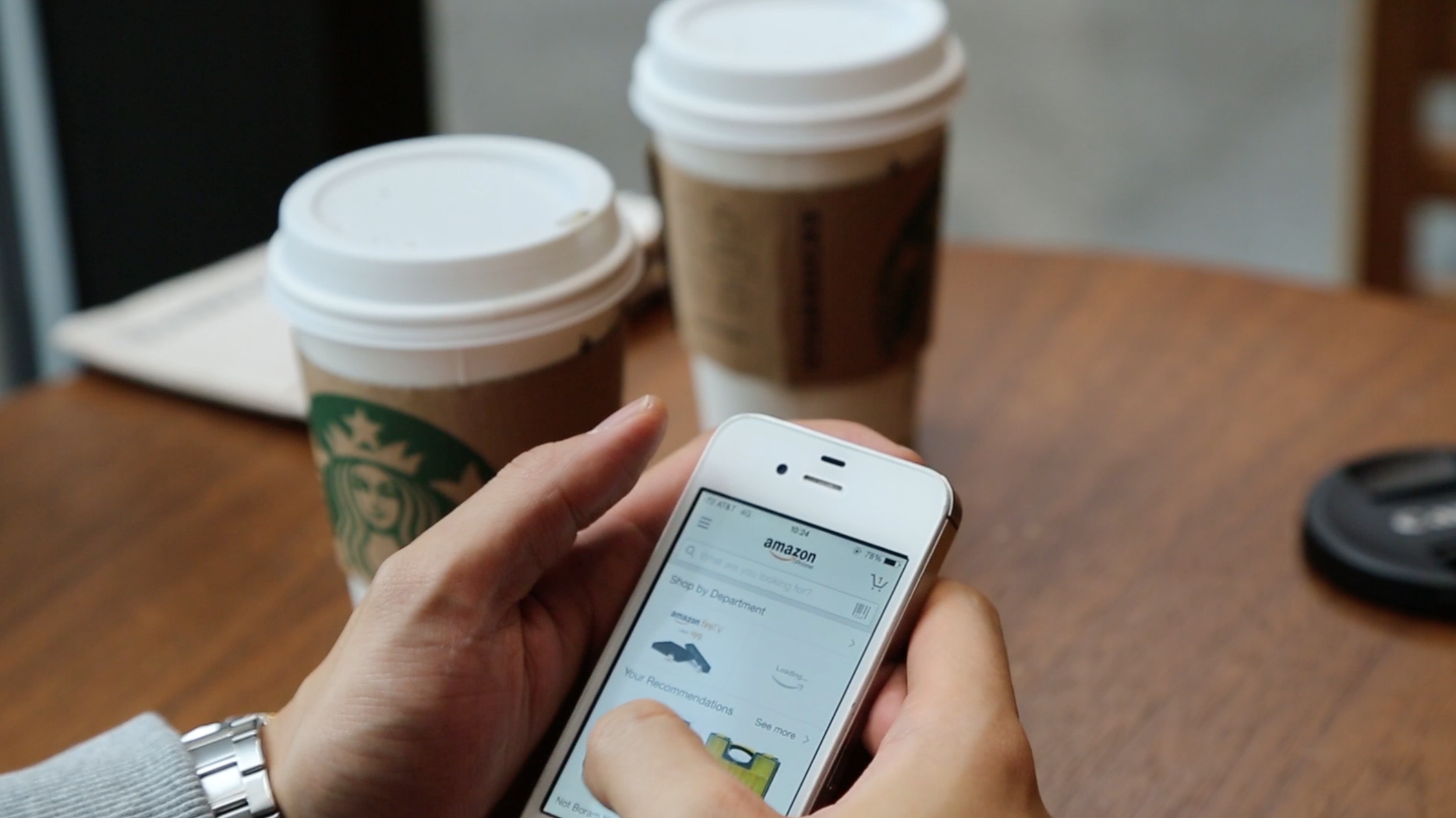
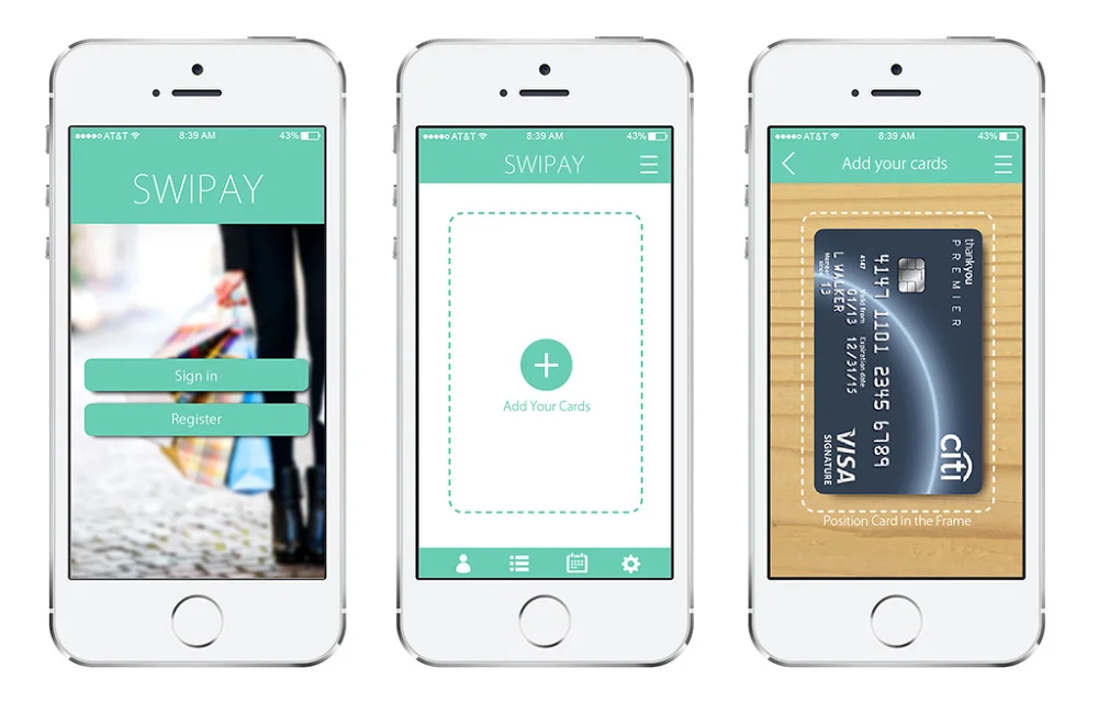
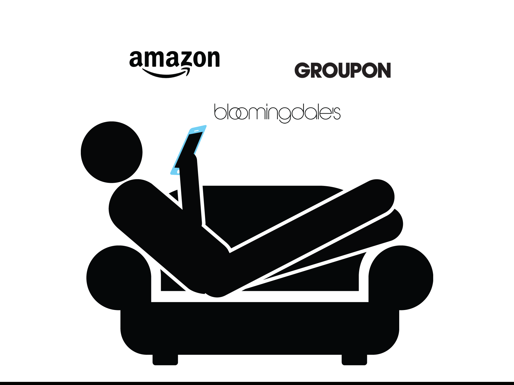
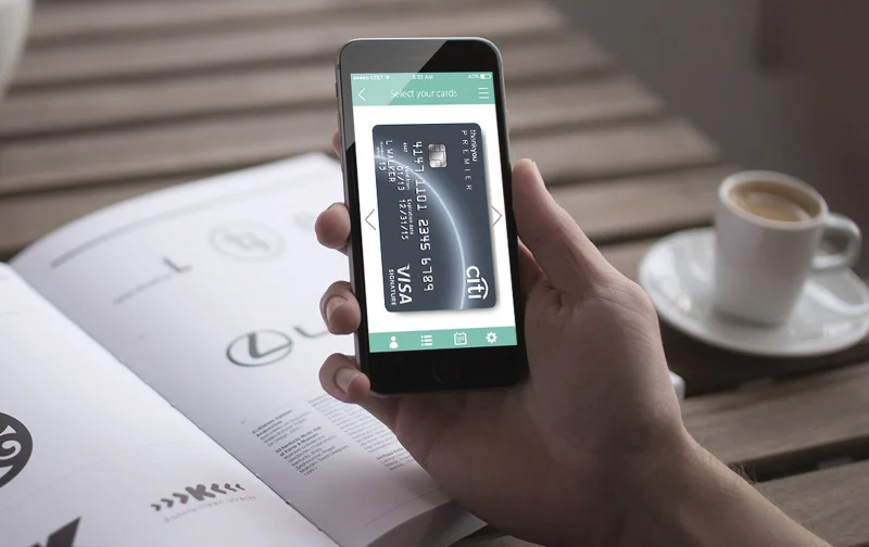
The app proposes a secure purchasing system that solves security issues and complications that often arise when shopping on mobile devices. It deliverers a simple interface that is safe, convenient and timesaving. We called it, SWIPAY. The application requires a one-time input of their personal and credit/debit card details with a fingerprint registration. The user can then shop all they want with quick and simple purchasing experience. Customers no longer need to worry about entering in their personal information to numerous sites with the SWIPAY app and Citibank card. Transactions can also be managed easily with summary of transactions, for all registered cards, in the application. Online shopping becomes hassle free and safe, anywhere you are.
Traditional ways of purchasing online, whether it’d be through PC’s or smart devices, users had to insert their credit card details such as security numbers and billing addresses, prior to making a payment. We take a completely different approach by bringing in a pre-registered credit card details that only the SWIPAY application can store, so the user would only need to perform a simple gesture in completing the checkout. This differentiates from all other offerings, as the card information will not be shared or provided to these shopping sites and it uses the safest means of security – your finger print.
My Role: UX Designer
Team member: Sehwan Park
Using: Illustrator, Premier Pro, Justinmind (Prototyping tool)
In collaboration with a design agency, we performed ideation workshops for a week to come up with design solutions to everyday problems.
The insights or problems were grouped to create 50 quick low-fidelity wireframes.
UI concepts were filtered with UX managers, based on the newly proposed brand identity and UX pillars.
Main wireframes and userflow with visual elements were made to be developed for On-device prototype.
User testing was planned and performed to find out overall user satisfaction, ease-of-use, and their frequency of use.
Talking to a number of shopping lovers was very helpful in defining deeper issues and why.
We had a number of brainstorming sessions on ways to make online transaction much simpler on smartphones.
Insights were gathered and discussed for design directions.
We sketched out wireframes and user flow keeping in mind the priority of our core features.
On-device prototype was made for user testing and demo purposes.
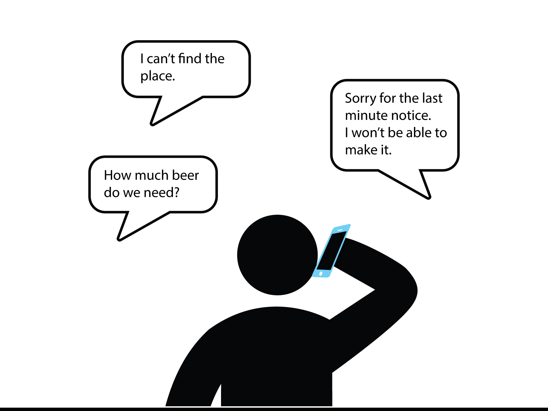
Searching for events or places can take up a really long time and effort.
Attendees have difficulties communicating to coordinator. It's difficult to track or follow-up with every attendees.
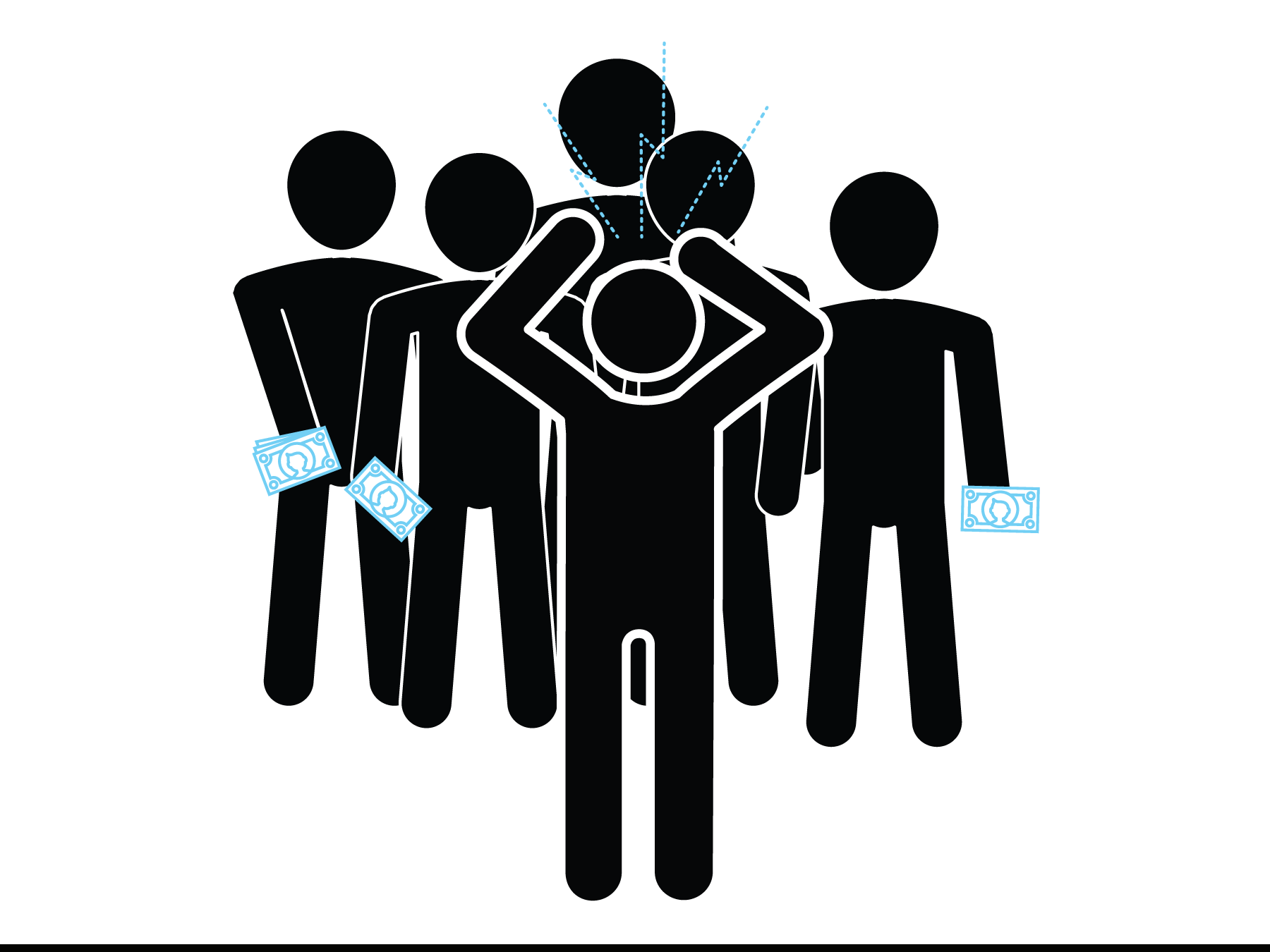
Payment followup is always annoying. Pre-estimated cost can alter a lot depending on the people who show up.
Benchmarking existing event apps was important in realizing a strong need in providing a new service.
Brainstormed the needs and divided essential features with nice-to-have features.
Sketched out the screens then made high-fidelity wireframes of the main screens.
I performed user testing and was able to gain some insights and problems to existing interface.
With some layout refinements I was able to complete the wireframes and user flow with visual designs.
From Prada brand research and brainstorming, visual and functional factors that influence a product's luxury level was defined.
Identified the target user and performed user interviews and user observations.
From interviews and observations, common and important characteristics and user actions were found.
Performed ideation workshop for new UX concepts based on our findings.
Made wireframes and user flow for the new UI guidelines and features. Gave suggestions for visual and transition effects.
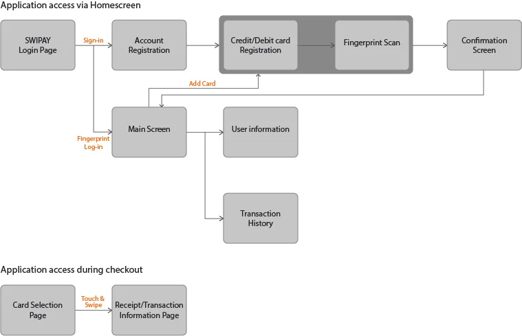
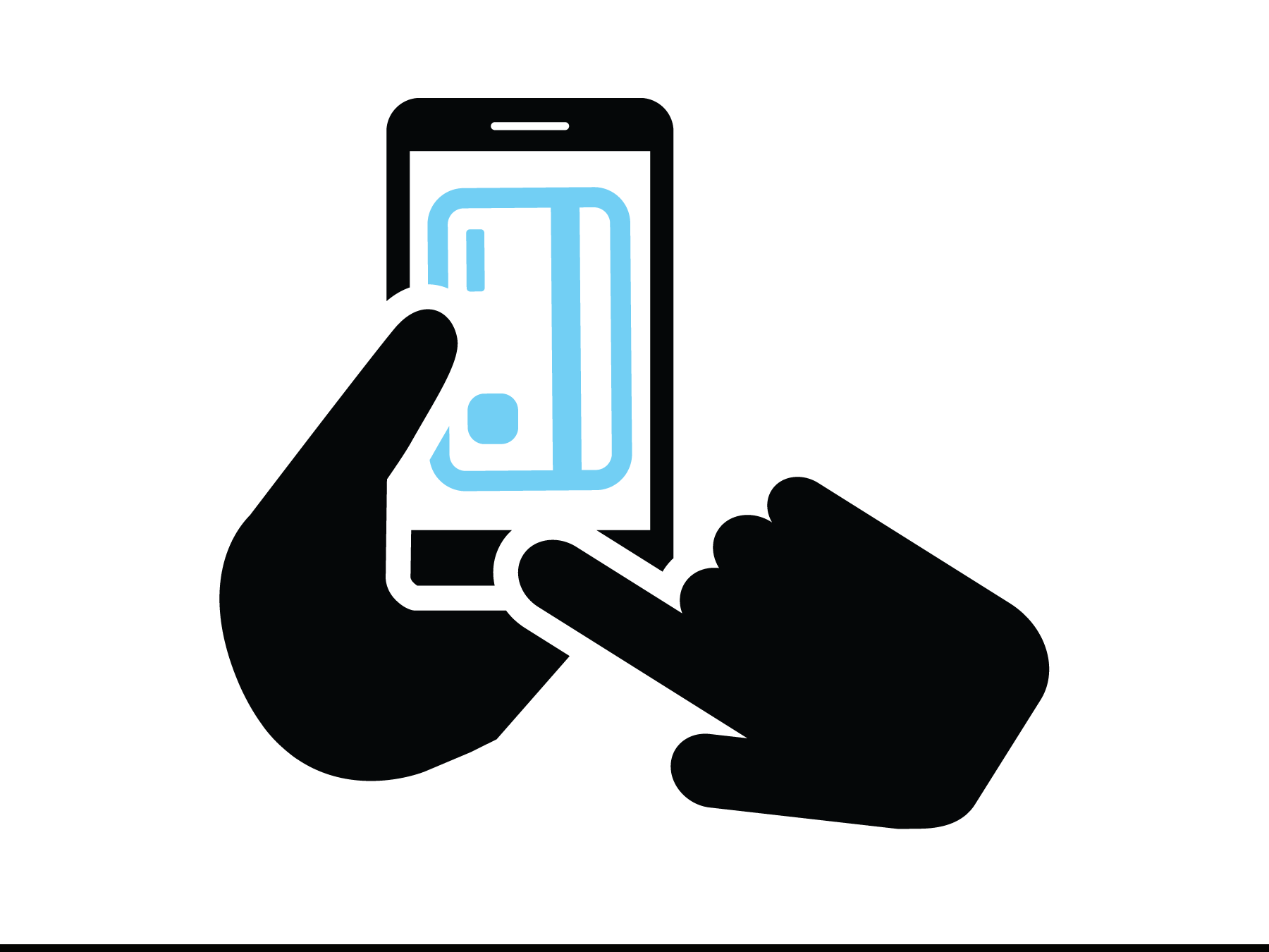
SWIPAY requires one time input of your personal data. But the process is super simple.
Shop from any online stores and when checkout is clicked, SWIPAY will automatically open with your usual credit card.
It uses the safest means of security, your fingerprint. Then when the credit card flips you swipe on the magnetic part as confirmation.
Conducted 4 in-depth interviews with DSPs and organized a brainstorming session with the team to align on key user flows.
Designed wireframes based on insights earned from customer interviews.
After a number of iteractions based on the team and leadership feedback, came up with final high-fidelity mockups and clickable prototype.
Tested the clickable prototype with DSPs by asking them to complete multiple tasks in different scenarios.
Made final iteration to the mockups and presented to the leadership for approval.